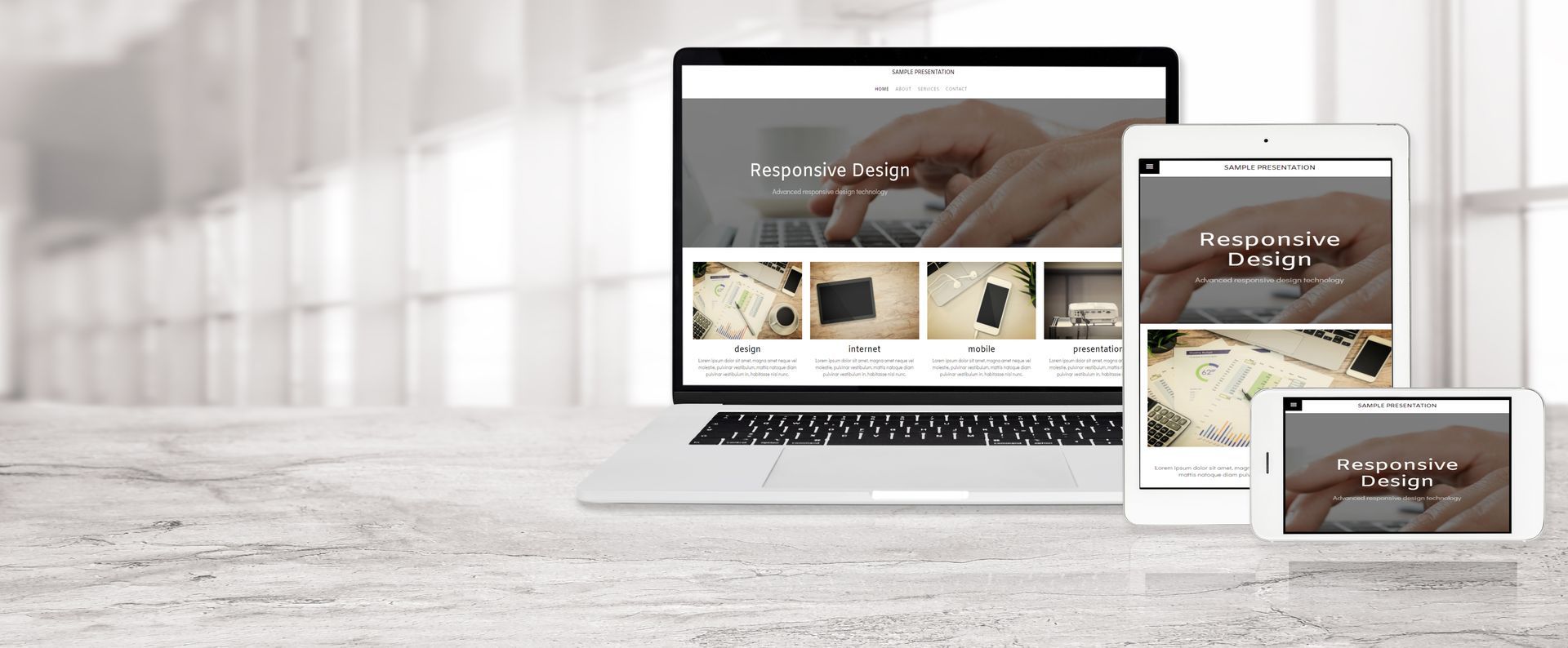
Responsive Web Design For All Devices: Web Design Essentials

In today's digital world, having a strong online presence is very important. Your website is usually the first place customers will visit, so it's crucial to make a good first impression. This is where responsive web design from Crescent City Marketing, among various website design companies, is useful. Responsive design lets your website change to fit different screen sizes and devices. It helps create a great user experience, whether someone is using a desktop, smartphone, or tablet to access your site.
The Importance Of Responsive Web Design In Today's Digital Landscape
With more people using mobile devices, it's very important to have a mobile-friendly website. Responsive Web Design The Woodlands helps your site reach more people, especially potential customers who are always on the go.
In addition to being accessible, responsive design is important for search engine optimization (SEO). Search engines like Google prefer mobile-friendly sites in their rankings. By using responsive design, you can improve your site's visibility, bring in more organic traffic, and boost your overall SEO performance.
Adapting To User Behavior Across All Devices
Think about the last time you used a website on your smartphone. Was it easy to move around, or did you have to zoom and scroll a lot to find what you needed? User experience is very important and can be different depending on the device you use.
Responsive design helps fix these issues. It makes sure navigation is simple, text is easy to read, and images are the right size, no matter the screen. This way, whether you are on a smartphone, tablet, or desktop, you will have a seamless user experience.
When you make your website work well on many devices, you show that you understand how users behave. This focus on user experience can lead to more people staying on your site, fewer people leaving right away, and higher chances of them taking action.
Boosting SEO With Mobile-Friendly Websites
When it comes to SEO, Google is very important. Google favors websites that are mobile-friendly. If your website is responsive, it is likely to rank better in search engine results pages (SERPs). This mobile-friendliness is one of the key factors that affect how well a site does on Google.
A higher ranking means better visibility and more organic traffic. When your site appears on the first page of Google's search results, you're likely to draw in more potential customers. These are people who are searching for products or services like what you offer.
By investing in responsive web design for your small business in The Woodlands, you are improving more than just how your site looks. You are making a smart choice for better SEO performance and following the best practices for web design. This can lead to steady growth for your business in the long run.
Key Elements Of Effective Responsive Design
Making a responsive website isn't just about making your desktop layout smaller. It needs careful planning. You should think about different screen sizes, resolution, and how users will interact with your site.
Now, let's look at some important parts that make a responsive design effective and appealing.
Flexible Layouts: Building A Fluid Foundation
The key to good website design is in the layout. Fixed-width layouts that use pixels are no longer popular. Now, flexible layouts are the way to go.
Flexible layouts use relative units like percentages. This lets websites easily change shape based on different screen sizes. A website with a flexible layout stays intact and looks appealing on smaller devices. It keeps working well no matter what.
Here are some reasons why flexible layouts are a must:
- Seamless Adaptability: Content fits nicely on different screen sizes.
- Enhanced User Experience: Browsing is fun and easy on any device.
- Improved SEO Performance: Google likes websites that work well on mobiles.
Media Queries: Tailoring Content To Screen Size
By using media queries, web designers can change how a website appears on different screen sizes. This is part of responsive web design. It helps make sure the website’s layout, images, and text look good on all devices, giving users a great experience. With Crescent City Marketing’s help, your site will look amazing on desktops, smartphones, and tablets. Paying attention to these details is very important today because user experience is key to keeping visitors interested and increasing sales.
Optimized Images For Faster Loading Times
In web design, speed is very important. Users want websites that load fast. If a site takes too long to load, people are likely to leave it, resulting in lost chances to make sales. One major reason websites load slowly is because of unoptimized images.
Using responsive web design can help solve this problem. This method focuses on making sure images are optimized. By using techniques like image compression and lazy loading, we can reduce image sizes without lowering their quality. When images load faster, it helps the website perform better.
Having optimized images improves not only user experience but also SEO. Search engines favor websites that load quickly. This means that by optimizing images, you can enhance your search ranking overall.
Tools And Technologies Behind Responsive Web Design
Making a website that looks good and works well on all devices involves more than just design rules. It also needs the right tools and technologies, including WordPress. Web developers use different languages and frameworks, including WordPress. They do this to turn responsive designs into real websites.
Now, let’s explore some important technologies that help with building websites that can adapt to any screen size. Click Website Design Dos and Don'ts: Common Mistakes to Avoid for more details.
HTML5 And CSS3: Cornerstones Of Modern Web Design
The base of every website is made up of HTML (Hypertext Markup Language) and CSS (Cascading Style Sheets), and often involves a CMS (Content Management System). HTML gives the simple structure and content for a webpage. CSS, on the other hand, defines how it looks and feels.
HTML5 is the newest version of HTML. It has features that make responsive design easier. New elements like <header>, <footer>, and <nav> help organize the web content better. This makes it simpler for developers to build websites that work well on many screen sizes.
CSS3 is the latest update to CSS. It adds cool tools for web design, like media queries, flexible boxes, and transitions. These tools allow developers to control the style and layout of web pages more precisely. This means they can create stunning and responsive designs.
Frameworks And Libraries To Simplify Development
Beyond the foundational languages of HTML and CSS, developers often turn to frameworks and libraries to expedite and simplify the development process. These pre-written code collections provide developers with reusable components and functionalities, saving them time and effort.
Here are a few examples of widely used frameworks and libraries:
| Framework/Library | Description |
|---|---|
| Bootstrap | Provides a comprehensive toolkit of pre-styled components and responsive grid layouts. |
| Foundation | Another robust framework that emphasizes mobile-first design and offers a range of design patterns. |
| React | A JavaScript library for building user interfaces with a component-based approach, ideal for complex web applications. |
How Crescent City Marketing Helps Optimize Your Website
At Crescent City Marketing, we know how important a good website and effective marketing materials are for your target audience and your business. Our skilled team of professional web designers and developers focuses on creating websites that look great and work well. We make sure each site is customized to fit your unique business needs.
But we don’t stop at just building custom websites. We offer ongoing maintenance, support, and SEO services in TX too. This means you can trust us to keep your website running smoothly. With Crescent City Marketing, you can focus on growing your business while we take care of the rest.
Conclusion
Responsive web design is very important today, especially in cities like houston. It helps create smooth user experiences on any device. When you adjust to how users behave and improve SEO with mobile-friendly sites, you can boost your online presence. Using flexible layouts, media queries, and optimized images is essential for good responsive design. Adopting HTML5, CSS3, and modern frameworks makes development easier. You can trust
Crescent City Marketing to improve your website’s performance. Stay in front of the digital world with a responsive web design plan. Want to enhance your online presence?
Contact us today.